

This is my fourth concentration and I don't know how I feel about it honestly. Some people have told me that they like it but I can't decide if I do or don't. I think it's too plain but I just copied straight from the picture so there wasn't much that I could add. I did it in a monochromatic style because it's different and I like doing paintings in just one color. It allows me to really focus on the shading and dark and light values instead of trying to get the perfect colors. I think my favorite part of this piece is the smoke coming out of the geyser. This is a picture I took at Yellowstone national park of a geyser just going off. I chose the red because the geysers reminded me of volcanoes which I think of red when I think of volcanoes. I think it's makes sense. Overall, this piece is nice but I don't think I like it as much as my last piece. My last piece definitely shows my style the best.
|
This is my third concentration piece and I really like it. I think this piece really shows my style and the direction I want to take my art. All the colors and different brush strokes are what I really like about this piece. I like how abstract and unique they are and how it makes the piece different than the average real life painting. This is definitely the style I enjoy the most. I find it easy and simple. Someone in class even described it as "child-like" and I kind of like that style. I didn't take any offense to that. I actually completely agreed. I think my style is very simple. Another thing someone told me to do was maybe add more shadows and depth to my paintings. My lines don't look as natural as I want them to look. I just feel like I'm not a realistic painter. And I paint pretty flat with no depth so I definitely want to work on that. I'll try to incorporate that in my next pieces by making the background duller and trying to improve my line work. Hopefully my pieces will just keep getting better.
For my second concentration I made it pretty simple. I just did some sand dunes in a desert. In the picture they looked red and pink so I really tried to emphasize that. I really like how they turned out but it may look a little too simple. I didn't really know what else to put in the picture because I only put in what I saw, which were hills. But overall I like this painting. It was fun and took me a really short amount of time. The hardest part was definitely the sky. The clouds are hard to do because it was really difficult to make them look realistic. I did my best and I still don't really like how it turned out, but I don't think it really takes away from the picture much. I also did this painting in acrylic so I could paint over stuff and now worry about everything blending together. It also made it easier because it dried fast and didn't stay wet for super long. Like I said, I like how this piece turned out and I think it goes well with my concentration idea. It really shows a different style of painting that's smoother and softer than my pieces before.
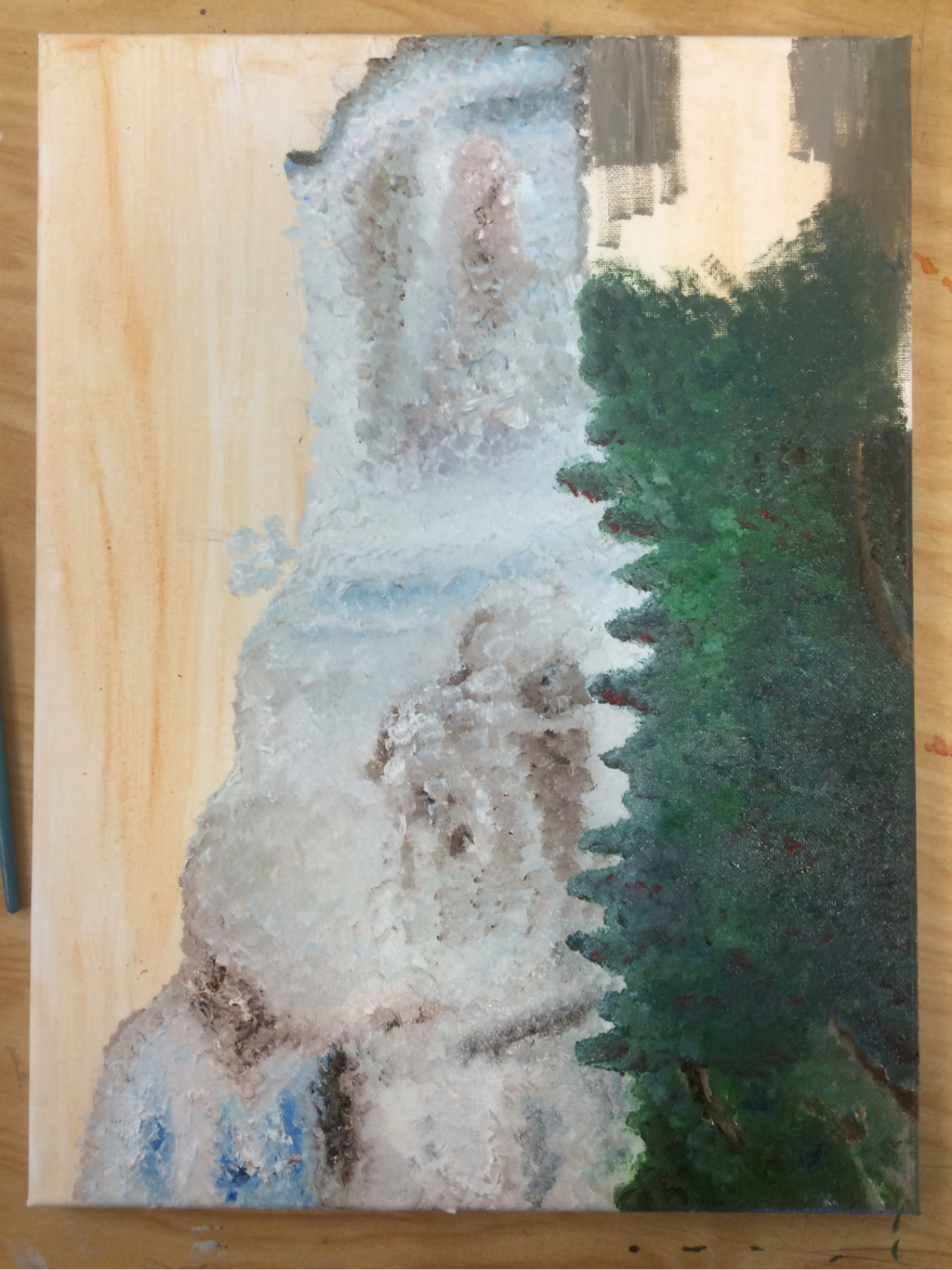 So this is it. The start of my concentration. For my concentration I chose "exploring nature through color, style, and texture." I like this because I really enjoy painting landscape scenes. I did this painting in oils because I've definitely become pretty fond of them. I like how easy they are to apply and how nice it is to blend with them. They are definitely one of my favorites. But I chose oils because I knew I would have to blend a lot of colors in the waterfall and in the trees on the side. Do I think oils were a good decision? Yes. But do I like this painting? Definitely not. It is very rough and honestly I can't even tell if it's a waterfall. I think I went for a too stylized look and it ended up just looking like a mess. I definitely learned a lot from this painting (like what not to do). At first I really like the way the waterfall was looking, but when I started adding in the greens it became so hard. All the greens began to blend together and I couldn't tell which tree was which. That's when the piece went to a place of no return, and I couldn't save it no matter how hard I tried. But I pursued through it because every artist has a flop piece, and this one was definitely mine. I hope not all my concentrations don't look as bad as this though. I'll work harder on the next ones just in case. (Btw Mrs. Rossi I'll post the final picture later. I forgot to take a final picture of the painting and I accidentally left it in your room when I visited you the other day. Don't worry it'll be up here soon enough when I'm able to take a picture of it!)
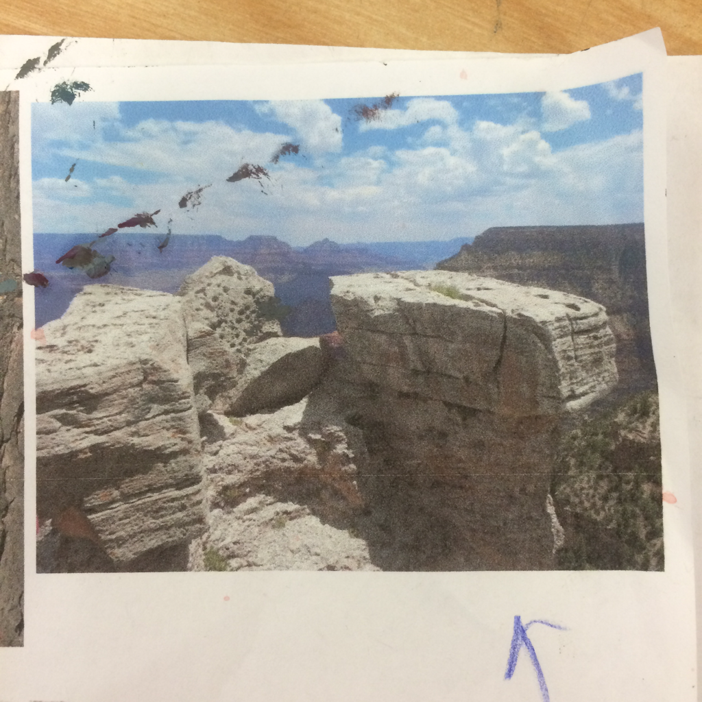 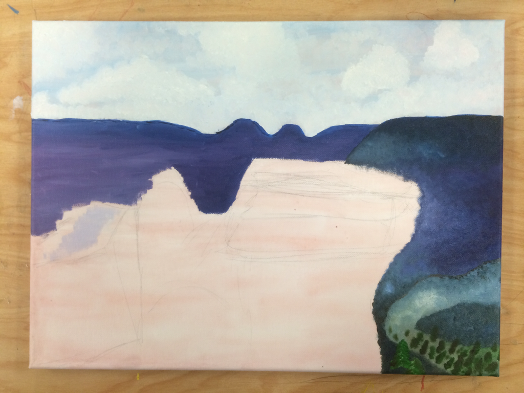 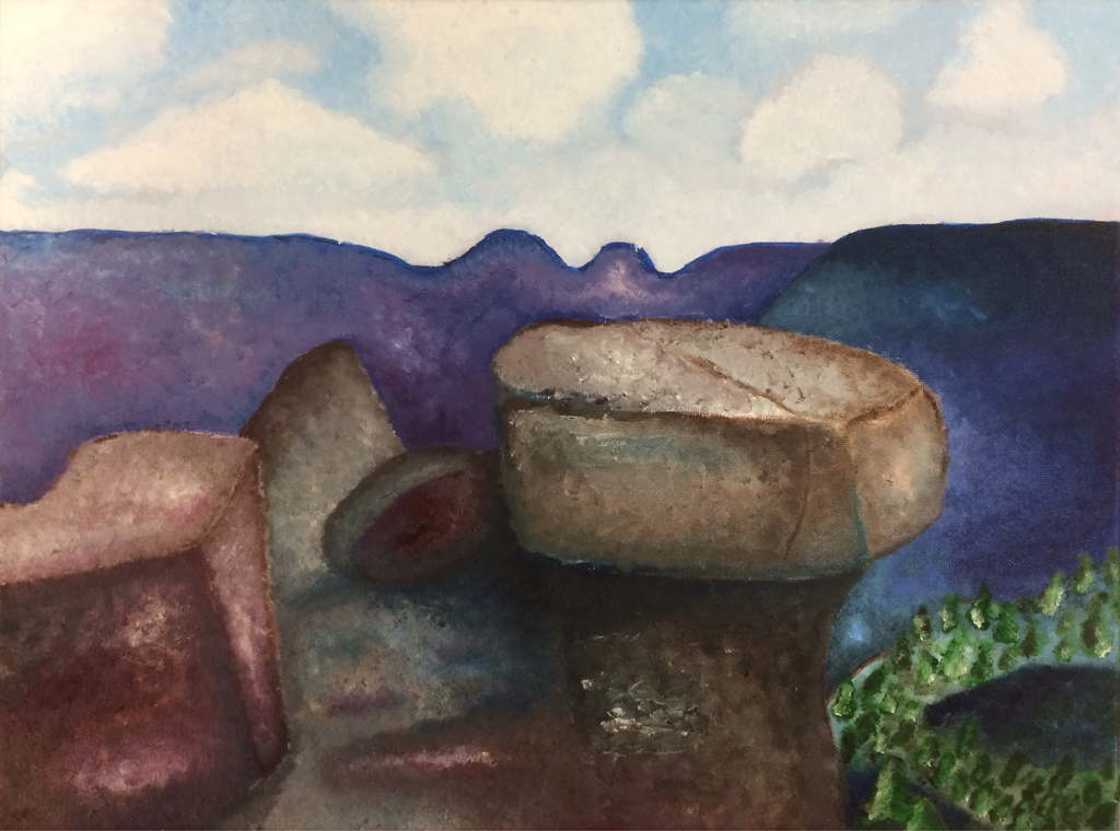 For my landscape I chose to do it in oils. I took this picture a few years ago when I was at the Grand Canyon for a summer trip. I chose oils because I wanted to use something that would blend well, and in the end I feel like oils definitely were the best choice. The whole point of the painting was to recreate the picture in my style. To make it more stylized and colorful and texturized. For the most part I think I did pretty well. I'm pretty happy with how it turned out. I learned a lot about blending, and adding highlights, and creating texture. I think something I need to work on with my paintings though is creating more depth. Even though it is a stylized piece and it's not supposed to be realistic I think some depth could really make it look a lot nicer. I also like this piece because it goes along with my concentration theme, so if I need an extra piece I could definitely use this one. The only thing I would like to change would definitely be the trees in the bottom right corner. They look a little weird. I probably should add some more darker and lighter values in them to make them pop more. But like I said, overall it's a nice piece and I'm happy with the way it turned out.
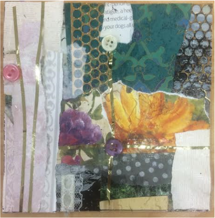 For this mini project I got to work with my "mentee". Her name is Althea and she is in Art I. I'm supposedly the "mentor", but for this project I really have to give the credit to Althea. She did awesome and basically took the reins and I just did what she said. The whole piece looked like a really old fashioned scrapbook collage, but Mrs. Rossi only cut out two smaller pieces from the whole collage that she thought were best. I got this piece and I really like it. I think this project was fun, and I think it was interesting working with someone else and seeing their process when creating a project. Overall though, I really don't think collage work is my thing. I think it is definitely Althea's thing though which is super cool for her! I wish I could do collage work because I think it's really fun and definitely different than painting and drawing. Maybe if I do a few more collages I could improve, but it's not worth my time right now when I have to complete 4 other projects in a matter of 3 weeks. I've named this piece "Scraps Book" because the style looks like a scrapbook but it is made of different scraps such as buttons, magazine clippings, and tissue paper. It's clever I know. Thank you for your applause.
      For this project, I chose to go with a color-blocking self-portrait, and I really liked the outcome. I got the idea on Pinterest from the picture in the top left corner and I thought it was really interesting in unique, but I changed it up a little when I did it myself. I made it look more like me and less cartoonish. I definitely thing the final product looks a lot like me. I think the project was a lot of fun. I chose prisma colors as my medium and I think it was a good choice to get the rich solid color that I needed for this project. I didn't struggle too much with this project, it was relatively easy to lay down the colors. I think the hardest part by far was trying to draw my face and get it proportionally correct. I think it took one day alone just to draw my face in pencil perfectly. But the time I took definitely made the outcome of the final piece better than if I had rushed my drawing. Another tough choice I had to make with this project was the color of the background. Since I used almost every color imaginable in my face, it was hard to choose a background that wouldn't clash or look repetitive. I chose gray because I didn't use any gray in my face, and it was a nice shade between the white and black blocks in my hair. Honestly, I don't think the gray was the best choice but by the time I started with the gray it was far too late to change my mind. Minus the gray background, I think this project is awesome. Maybe in the future I can do more color blocking methods because it was a fun thing to do, and super easy. I hope other people see the uniqueness in this piece like I do. I decided to name this piece "Block Me" because of my choice of the color-blocking technique. And it's also clever because of social media terms. Which Mrs. Rossi won't understand because she doesn't know what Twitter is. LOL, Jk Mrs. Rossi you're great!
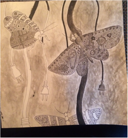 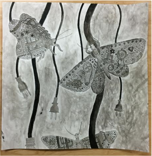 For this project we had to take something from nature and basically turn into something mechanical. I chose butterflies because I thought it would be cool to make their wings on hinges. Turns out as I got more into the project I didn't even end up doing that. I still really liked this project and I liked how it turned out. I chose a different medium than I am used to called ink paint (or something like that). Basically you paint but with ink, so everything is different shades of gray. So I officially call this piece "50 Shades of Gray-t Butterflies". It's cute, I know. Anyways, I really enjoyed working on this because it was different to work with the ink. It was kind of difficult to get all of the values I wanted because I was so limited with one color: black. But overall it was a cool experience. I really liked how I could basically just freely create anything I wanted mechanically. I just let my imagination run wild with different types of gears, belts, pipes, cords, plugs, bolts, etc. It was cool because normally Mrs. Rossi makes us draw straight from a picture and being able to let my imagination run free was a nice change. I hope I will be able to do more projects like these in the future. One thing I think I could improve would definitely be the different values in the piece. When I was finished with the piece people told me that all the different shades looked relatively the same and I agree. I could've worked a little harder on the contrast in the values and made them a little bit more dramatic, but by the time I was given this tip I had already finished my project and was on to the next. I'll definitely keep that tip in mind though for my future projects. And who knows, maybe I'll do another ink project just to see my improvement!
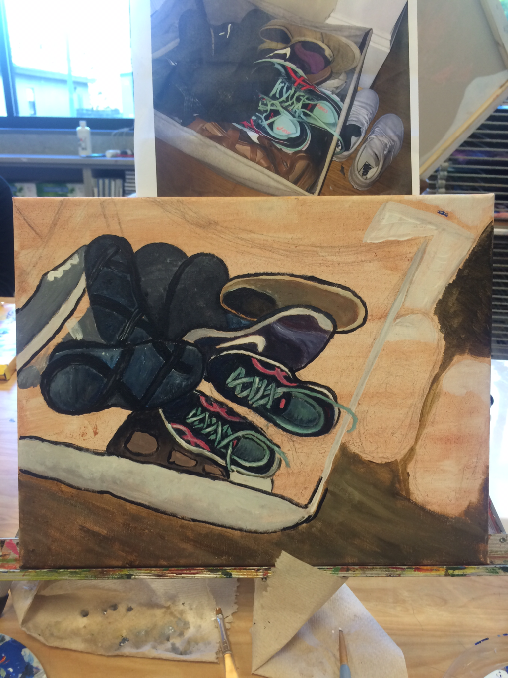
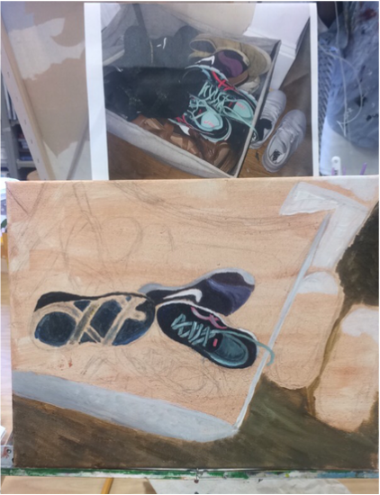
For my interior space I did none other than a basket of shoes. This was not fun at all. I think the main thing I have learned from this painting was the fact that I really hate painting shoes. It's clearly just not my thing. It was hard to get all of the small tiny details on each shoe and I just got bored and lazy and frustrated with it so I pretty much wanted to just give up, but I couldn't. No, I did not try my hardest with this project because I really just wasn't a fan. Mrs. Rossi loves shoes so of course she loved the idea of me doing them, but I don't think she realized that I have a certain style, and shoes just don't really go with my style. Hopefully one day I'll be able to paint shoes perfectly, but that day is not any time soon. It's okay though. It was still a good experience and I definitely learned a lot about me and what I do and don't like to paint.
|
Archives
May 2016
Categories |


 RSS Feed
