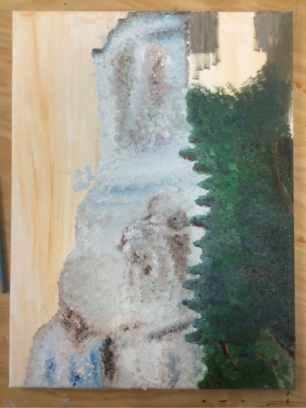
So this is it. The start of my concentration. For my concentration I chose "exploring nature through color, style, and texture." I like this because I really enjoy painting landscape scenes. I did this painting in oils because I've definitely become pretty fond of them. I like how easy they are to apply and how nice it is to blend with them. They are definitely one of my favorites. But I chose oils because I knew I would have to blend a lot of colors in the waterfall and in the trees on the side. Do I think oils were a good decision? Yes. But do I like this painting? Definitely not. It is very rough and honestly I can't even tell if it's a waterfall. I think I went for a too stylized look and it ended up just looking like a mess. I definitely learned a lot from this painting (like what not to do). At first I really like the way the waterfall was looking, but when I started adding in the greens it became so hard. All the greens began to blend together and I couldn't tell which tree was which. That's when the piece went to a place of no return, and I couldn't save it no matter how hard I tried. But I pursued through it because every artist has a flop piece, and this one was definitely mine. I hope not all my concentrations don't look as bad as this though. I'll work harder on the next ones just in case. (Btw Mrs. Rossi I'll post the final picture later. I forgot to take a final picture of the painting and I accidentally left it in your room when I visited you the other day. Don't worry it'll be up here soon enough when I'm able to take a picture of it!)
 RSS Feed
