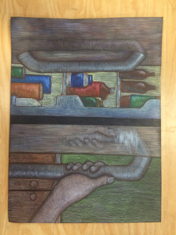
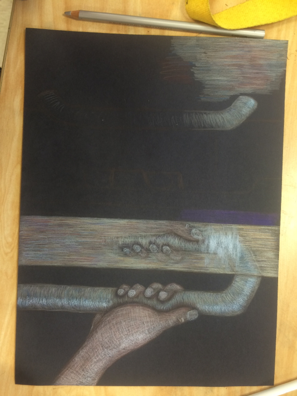
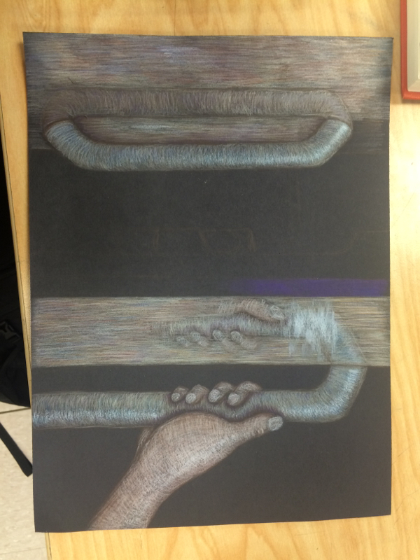
In this piece we were supposed to do a reflection of ourselves in prisma colors. Now I've never used prisma colors for me so this was a little bit of a challenge for me. I really liked the way they layer and blend but it was just a different experience for me. They reminded me a lot of oil pastels which is by far my favorite material. I think if I kept practicing with prismas then I could get really good at it. This piece I think turned out alright, but not the way I wanted it. I thing it looks a bit muggy and not as bright and vibrant that I wanted it to be. But I think that was just because of the paper that I chose. Maybe if I had tried to use a lighter paper instead of black it could've been better. But overall I really enjoyed trying out the prismas and I kind of like this piece so at least it wasn't a complete waste.
My third piece was submerging an object in water and drawing it and I absolutely loved this piece. I just love the way that water is so simple but so confusing. The way that water distorts things just fascinates me. I decided to put a straw in water and capture the way the water separated the straw. I think I did pretty well with my shading and capturing the realistic aspect of the piece. I would definitely say I struggle with making realistic things seem realistic so I am pretty proud of this piece. I think I could've done better on the background but the main part of this work was the cup and that's what I like the best. This piece was part of my concentration. My concentration was the whimsical side of nature because I love drawing nature, but I never draw them realistically. I like to give things different and brighter colors. So for this piece I decided to do a mountain in different colors and blend them together to make it look 3-D. This piece didn't quite turn out the way I wanted it to, but I still actually like the way it turned out. It's different than my usual style. And I loved working on this piece because I love blending paint on canvas. Overall, I loved working on this piece and I'm happy with the way it turned out. My first piece for the summer was the "interesting interior" piece. I must say that it is by far my least favorite. At first I loved it when I was drawing the different plates and bowls from inside of the kitchen cabinet, but once I started to color in the different plates I began to get frustrated with the piece. There was so much brown and white and not enough color in the cabinet. I think I could've made it better by possibly just adding random colors that weren't even in the picture. Overall, I'm pretty unhappy with the piece, but I've learned from my mistakes and can just put this piece in the past now. My second piece of summer was the self portrait. This was pretty difficult since I've never really been taught how to draw people but I feel like I did a pretty decent job. The main thing I tried to work on with this piece was shading and blending and I feel pretty good about that. I worked hard on making my darks dark and my lights light. I think the hardest part of the piece was my nose, I don't know why but I can't draw noses. It took me forever to get it just right and I still see flaws in it. But overall, I really enjoyed working on this piece because it was a little out of my comfort zone but I think I learned a lot from doing this. My final piece is probably my favorite because it's exactly my style and it's something I can keep with me forever and it'll always have meaning to me since it's a picture of my street that I've lived on since I was 5. After drawing my street, I used watercolors to get a base coat of color. Then I went over it with colored pencils to get brighter brights and I think this technique worked out really well for me. I also think this piece really captures the view I wanted for my concentration. Overall, I love this piece and I think it's one of my best works. My fourth piece was a multimedia design of a still life and I chose to do an orange. First I put down tissue paper of different colors to get a colorful background. Then in pencil I drew and shaded the orange. And then with an orange colored pencil I shaded in the table. I really love this piece because it's just so bright and colorful. I also worked hard on the shading to make the orange look as 3-D as possible. I think I did pretty good on that part. If I could redo this I would probably not make the orange front and center. I did not follow the rule of thirds and that's my biggest mistake. But overall I still really like this piece and I'm proud of all the work that went into it. |
Archives
May 2016
Categories |